Mapping Health Visualizer
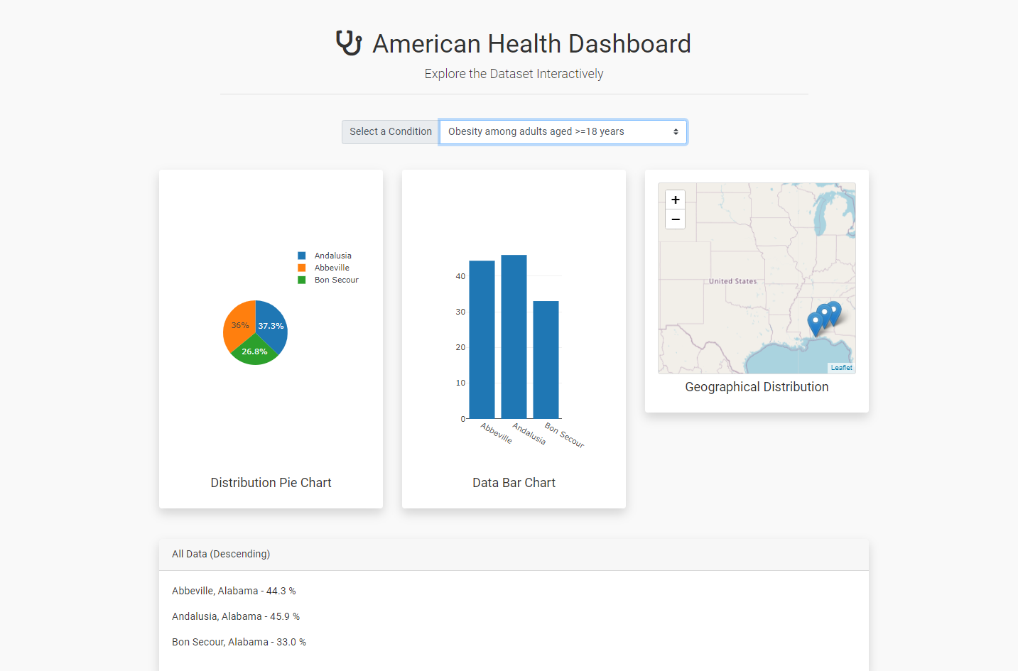
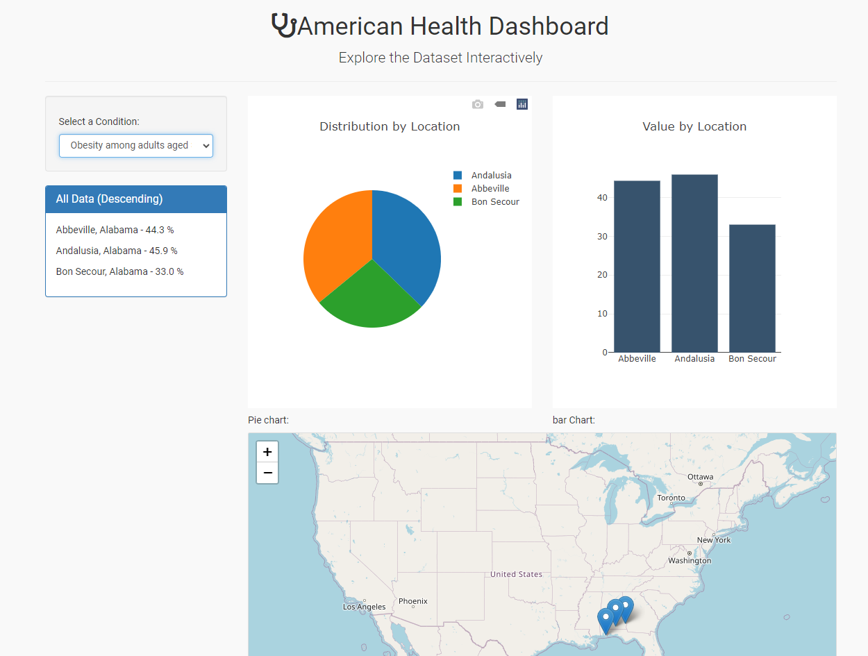
American Health Dashboard
Explore the Dataset Interactively
Obesity COPD Coronary Heart Disease Diabetes Cancer (except skin)
UI/UX Design 1
UI/UX Design 2
Goal of Project:
Using two-year health data from the CDC to create visuals for the data and using an ML model to predict the outcome.
Problem-Statement:
Visualization of the data is currently focused towards simple monitoring and tracking. This presents a unique challenge for visualization and interactivity; the new dashboard will solve for this by providing:
- Improved Interactivity and data insights.
- Improved trend visualization featuring heat-mapping for data.
- Healthcare and Mental Health Resource Needs:
- Insurance levels across the United States (create a dashboard that allows users to see the various areas of the US that have coverage and the density of coverage).
- Display general healthcare & mental health trends across the US.
Due to the heavy volume of data if we use all of the data points from the CDC (1 to 3 million datapoints per year), filtering on five (7) health data points and thirteen (13) states would be the best approach.
Health data points:
- Cancer (except Skin)
- Coronary Heart Disease
- COPD
- Obesity
- Diabetes
- Health Insurance
- Annual Checkup
Thirteen (13) states:
- Alabama
- Arizona
- Arkansas
- California
- Colorado
- Connecticut
- Delaware
- District of Columbia
- Georgia
- Hawaii
- Idaho
- Illinois
- Indiana
For Machine Learning:
We'll be using the KNN model since we have two years of data for comparison.
Role Assignments:
- Lead Developer: Masoud - Overall Design, Structure, and Implementation
- Git Master – Nathir (Thursday)
- Set-up Master Repo
- Settings: Collaborators
- README
- Git Pages
- Database Engineering: Edwin & Ronald
- ETL - includes extracting, filtering, sorting, dropping NaN, merging, concatenating, model testing, etc.
- Database Development (MySQL)
- Flask (Nathir – Backup Dev)
- Front-End Development Team: Nathir, Edwin, Ronald, Masoud
- User-Interface and Design (Figma front-end design)
- Javascript, CSS (bootstrap), HTML, Python, Pandas